Let's take a moment to marvel at how bad the original USDA food pyramid was
Edited 2025-05-26 to correct an inaccuracy—originally I said butter goes in the Dairy group but actually it goes in the Fats, Oils & Sweets group.
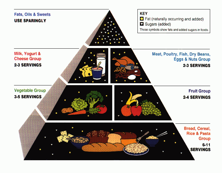
The original 1992 version of the USDA Food Pyramid was bad. So bad that people who scrupulously followed the guidelines were barely healthier than the people who ignored them.1
But the Food Pyramid was not just wrong: it was marvelously wrong. It was wrong in many ways simultaneously. It achieved levels of wrongness hitherto undreamed of.
What was wrong about it? I will start with the obvious answers, and move into the philosophical.
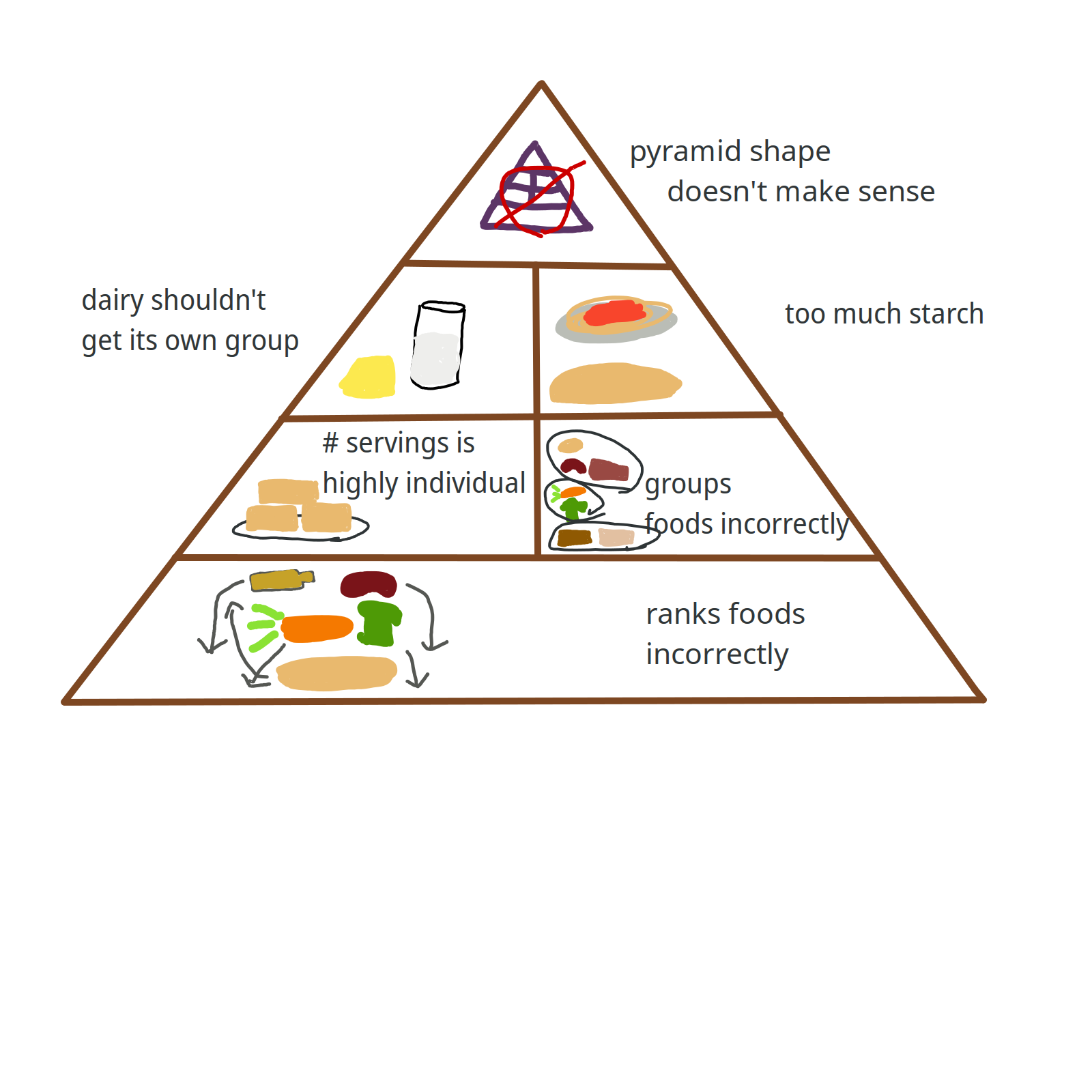
- Its ranking of the healthiness of foods is wrong. Refined grains are healthier than fruits and vegetables?2 Processed meat and nuts are equally healthy? All oils should be used sparingly? What?
- It lumps together foods that shouldn’t go together: whole grains + refined grains; red meat + healthy proteins + nuts; fats + oils + sweets.
- Nutritionally speaking, white bread has more in common with sweets than it does with whole grains. Oils (unsaturated fats) have more in common with nuts than they do with trans fats.
- It implies there are specific numbers of servings of each food group that you should have, which is wrong in two ways:
- Required servings vary a lot from person to person. If I followed the upper end of the serving guidelines, I would be too skinny (I think—I’m not really sure how much food is in a “serving”). For some people, the lower end is still too much food.
- Giving a servings range (e.g. 3–5 servings for vegetables) implies that healthiness follows an inverted U curve, and it’s bad to eat too much or too little. But that’s usually not true: there is effectively no such thing as eating too many vegetables.3 There is no such thing as not eating enough trans fat (the ideal amount is zero). You can eat zero grains (keto diet) or zero meat (vegetarian diet) and still be perfectly healthy.
- It fails to say anything about micronutrients or vitamin deficiencies—or even macronutrients for that matter.
- The whole concept of a “food pyramid” is fundamentally flawed. It rests on the incorrect assumption that there are different food groups that you should eat in different amounts. It would be more accurate to say there are
- some foods you should eat, and there’s effectively no upper limit (fruits + vegetables);
- other food groups you can have plenty of as long as you don’t eat too many calories overall (whole grains, beans, nuts, seeds, vegetable oils4);
- and some foods where the ideal amount to eat is zero (trans fats, sugar, refined carbs, processed meat).5
(Bonus wrongness fact: I didn’t notice this until I inspected the food pyramid closely, but it says fruit contains added sugar, as indicated by the white triangles in the “fruit” section. This is so obviously incorrect that it’s kind of baffling why they drew the pyramid this way. Perhaps what they meant to say was that fruit contains sugar, but the key specifically says the white triangle indicates “added” sugar.)
To illustrate the beauty of the USDA’s achievement, I present to you the Food Wrongness Pyramid:6
The Healthy Eating Plate, by the Harvard T.H. Chan School of Public Health, fixes most of the problems with the USDA Food Pyramid:
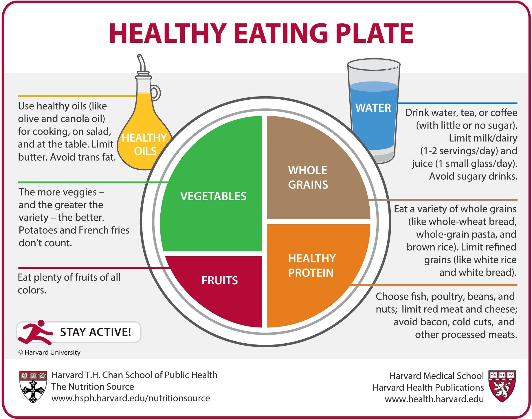
- It uses a plate instead of a pyramid! This is a good shape! It correctly implies that you should eat some of each of the food groups on the plate, and you should try to avoid foods that aren’t on the plate.
- It says that there are some foods you should eat, and other foods you should avoid. (Eat whole grains; avoid refined grains.)
- It correctly identifies which foods are healthy. (No putting starches at the bottom of the pyramid!)
- It groups foods in a sensible manner. (Whole grains get a group; healthy proteins get a group; healthy oils get a group. There is no “starches” or “meat” or “fats + oils + sugars”.)
- It suggests relative proportions instead of numbers of servings.
- It pays attention to macronutrients: the plate includes both protein and oil (= fat). (It doesn’t mention carbs, but that’s okay because it’s pretty much impossible to under-eat carbs.)
- It still doesn’t say anything about micronutrients, but if you follow the prescribed guidelines, you’ll probably get enough micronutrients anyway.
MyPlate, the USDA version of the Healthy Eating Plate, is similar to Harvard’s version except that they made it worse, probably because of lobbyists or whatever (it says red meat counts as a healthy protein; it gives dairy its own category7; it doesn’t say anything about healthy fats).
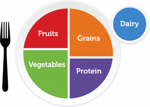
This is a side note but I think it’s funny how everyone puts nuts in the “protein” bucket even though most nuts have about as much protein as grains (which is to say, not very much). I would rather put nuts in the “oil” group…obviously nuts aren’t oil, but both nuts and oil are desirable as a source of unsaturated fat, so they should go together.
Notes
-
McCullough, M. L., et al. (2000). “Adherence to the Dietary Guidelines for Americans and Risk of Major Chronic Disease in Men.”
McCullough, M. L., et al. (2000). “Adherence to the Dietary Guidelines for Americans and Risk of Major Chronic Disease in Women.” ↩
-
Technically it doesn’t say grains are healthier than fruits/veggies, but it puts them lower on the pyramid, which naturally leads you to believe that they’re healthier. ↩
-
I’m sure someone in history has over-eaten vegetables at some point, but practically speaking you’re probably never going to get there. ↩
-
and probably also poultry, fish, and eggs, but eating those is bad for animals. ↩
-
Plus a short list of exceptions like sodium and fat-soluble vitamins, where you want to eat some but not too much. ↩
-
The items on this pyramid don’t match up with the items in my article because I revised the article a bit and I didn’t feel like re-making the image. I put a ton of work into my pyramid, as you can probably tell by the intricate and high-quality illustrations. ↩
-
The USDA MyPlate website says soy milk counts as dairy. Which, like, I guess I get what they were going for, but why is this category called “dairy”? ↩